Skyscraper ads are a classic display advertising format designed for desktop websites. Their tall, narrow shape makes them a natural fit for sidebars and wide page layouts. On content-heavy websites, they can provide additional ad inventory without interrupting the main reading experience.
Because they sit alongside the content rather than inside it, Skyscrapers are particularly useful on websites where visitors spend time scrolling through longer pages.
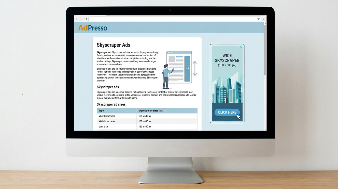
A Skyscraper is a vertical display ad format that typically appears next to the main content area. The two established sizes are 120 × 600 pixels and 160 × 600 pixels, with the latter commonly referred to as a Wide Skyscraper.
The smaller format works well when the available sidebar space is limited. The Wide Skyscraper provides more room for the creative and can be a better fit for wider desktop layouts.
| Format | Dimensions | Typical use |
|---|---|---|
| Skyscraper | 120 × 600 px | Narrow desktop sidebars and smaller content layouts |
| Wide Skyscraper | 160 × 600 px | Wider sidebars and larger desktop layouts |
If your ad setup allows multiple sizes in the same placement, supporting both formats gives you more flexibility when serving available inventory. Instead of restricting a placement to a single creative size, you can use the available ad space on your site more effectively.
The most obvious position is the classic sidebar, where the ad sits alongside the main content. This works particularly well on desktop layouts with a defined content column and enough space on either side.
Another option is an out-of-container placement. Instead of keeping the ad inside the website’s main content container, you position it in the surrounding margin area, usually closer to the outer edge of the screen. This can be useful on wide desktop screens where there is otherwise unused space.
Out-of-container placement and sticky behavior are often used together. The first determines where the ad appears, while the second controls what happens when the visitor scrolls. A sticky Skyscraper can remain visible in the viewport as the page moves, giving the ad more opportunity to be seen without placing it directly inside the article.
The sticky behavior should stop before the visitor reaches the footer. This prevents the ad from overlapping other page elements and keeps the layout predictable.
Simply placing an ad in the sidebar does not guarantee that visitors will see it. As soon as someone scrolls past the ad’s original position, it may leave the viewport.
Sticky behavior addresses this limitation by keeping the ad within the visible area as the visitor scrolls. This can increase the time the creative is available for viewing and make better use of sidebar inventory on long pages.
The combination of an out-of-container position and sticky behavior is therefore particularly useful for desktop publishers. The ad can use otherwise unused space next to the content while following the visitor through the relevant part of the page.
Skyscraper ads are fundamentally desktop-oriented formats. At 600 pixels in height, they can take up a large part of a mobile viewport and quickly become intrusive. Depending on the implementation, they can interfere with navigation, obscure content, or make the page harder to use.
For mobile traffic, formats such as 320 × 50 or 300 × 250 are generally more suitable. Rather than forcing the same ad format across every device, publishers can serve different formats based on screen size.
AdPresso's device condition feature makes this setup easier to control. Desktop visitors can receive the Skyscraper placement, while mobile visitors receive an alternative format that fits the available space.
If you want to experiment with Skyscrapers on mobile, test the setup carefully. Long-form pages and specific creative treatments may offer more room for experimentation, but you should always monitor the effect on readability and user behavior.
Skyscrapers are primarily visibility formats. Their position next to the content gives advertisers a persistent presence without interrupting the article itself.
That makes them a useful complement to other placements. In-content rectangles, for example, can appear at points where visitors are already engaged with the article, while a sidebar Skyscraper provides an additional advertising surface throughout the page.
The right mix depends on your website’s structure, the amount of desktop traffic you receive, and how visitors interact with your content. Rather than evaluating a Skyscraper placement in isolation, look at how it performs as part of your complete ad setup.
For WordPress publishers, the challenge is not creating a 120 × 600 or 160 × 600 banner. It is managing where the ad appears, how it behaves during scrolling, and what happens on smaller screens.
AdPresso handles these elements through placements rather than requiring publishers to modify their theme code. A Skyscraper can be used in a classic sidebar or placed outside the main content container. Combining this with sticky behavior keeps the ad visible while the visitor scrolls and prevents it from running into the footer.
Device-based conditions also let you separate desktop and mobile delivery. You can serve a Skyscraper to desktop visitors while showing a more suitable ad format to mobile users.