For us publishers, Google AdSense can be a powerful tool for monetizing web content. But here’s the rub: squeezing out every last drop of earning potential isn’t just about slapping ads onto your page. It hinges crucially on picking the optimal Google display ad sizes. Stellar ad performance stems from cleverly combining the right sizes, placing them strategically, ensuring your users have an outstanding experience, and, of course, optimizing your entire website.
Let’s be real, the online advertising market is colossal. Google AdSense alone generates an eye-watering revenue of over $200 billion annually. Banner advertising itself is a huge industry, projected to reach $155.07 billion in 2022, with mobile banners accounting for a whopping $108.60 billion of that. These numbers shout loudly: optimizing your Google display ad sizes for both desktop and mobile is essential if you want to stand a fighting chance in this dynamic arena.
This article gives you the complete rundown of all the Google display ad sizes Google supports. I am packing it with data-backed insights and practical tips to help you fine-tune your AdSense strategy and seriously pump up your ad performance for good.
An AdSense ad unit is simply one or more Google ads that pop up because of your AdSense ad code. Publishers can whip up, tweak, and manage these ad units right from the “Ads” page in their AdSense account.
Responsive Google display ad sizes are the default in AdSense these days, and for good reason. They automatically adjust their size, appearance, and format to fit your page layout and the user’s device – whether it’s a smartphone, tablet, or desktop. This automatic adaptability maximizes the ad inventory available for your site, which can lead to higher earnings. For us publishers, it makes managing ads a whole lot simpler since you don’t have to create a gazillion fixed ad versions.
Responsive ads also smoothly handle screen orientation changes, ensuring your ads remain consistent even when users rotate their devices. Plus, on mobile devices in portrait mode, responsive ad units automatically expand to full-screen width. Google’s experiments show this move seriously boosts performance and revenue.
Google’s heavy focus on responsive ads is a direct response to the shift in user behavior. Mobile devices now account for a huge chunk of digital ad clicks (we’re talking 60-70%), and they dominate global click-through rates (48.5% versus 41.5% for desktops in 2023). Mobile commerce is booming, too, by the way.
This overwhelming shift to mobile demands ads that adapt seamlessly to different screen sizes and orientations. Fixed Google display ad sizes would lead to a miserable user experience – think of advertisements that are cropped, tiny, or gigantic and don’t fit. So, implementing responsive ads isn’t just a cool feature; it’s a strategic must-have to maximize ad visibility and engagement on the platforms where everyone’s hanging out. Publishers who don’t prioritize responsive design risk significant revenue losses and a bummer user experience.
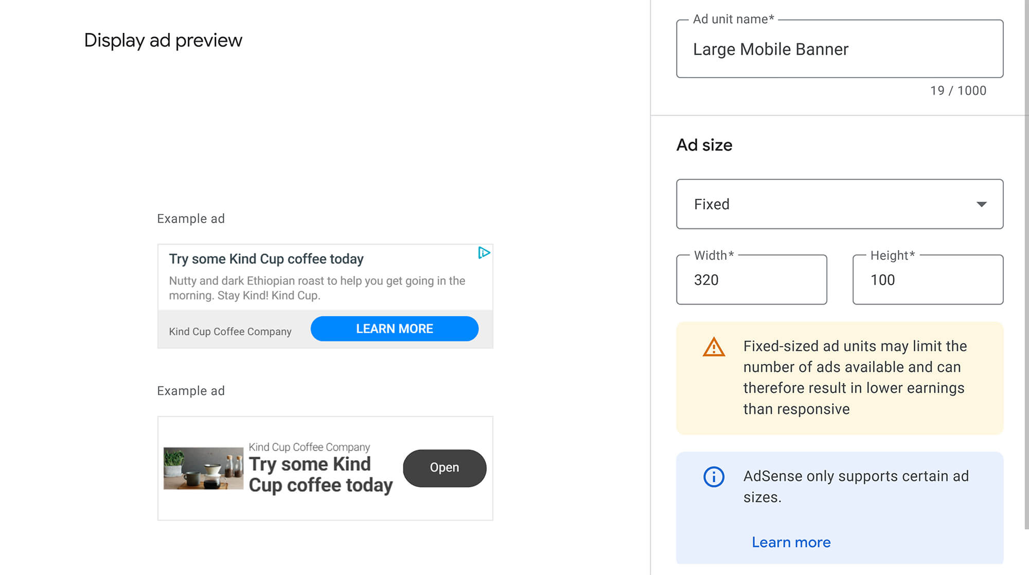
Don’t get me wrong, responsive ads are generally the champions. But fixed-format Google display ad sizes do let publishers set exact widths and heights. This can be handy if a specific, fixed size fits your page layout perfectly or if a particular regional ad size happens to be extremely popular.
Sadly, though, fixed units have their downsides: they don’t dynamically resize, and they won’t react to screen orientation changes. Additionally, some fixed sizes, such as 120x60, may have a significantly smaller ad inventory, which can dramatically limit your earning potential. Fixed ads also have strict size limits: only one dimension can exceed 450 pixels, the minimum width is 120 pixels, the minimum height is 50 pixels, and neither height nor width can go over 1200 pixels.
The choice between fixed and responsive Google display ad sizes is a trade-off between control and optimization. Fixed sizes provide precise control over dimensions, but this comes at the cost of dynamic adaptation. If you pick a fixed size with not enough inventory or one that doesn’t adapt to different devices, you may end up with lower fill rates and miss out on revenue.
Therefore, publishers must carefully weigh whether aesthetic or layout-specific needs for a fixed size truly outweigh the inherent benefits of responsive ads in maximizing revenue. Unless you have a rock-solid, data-backed reason, responsive ads should be your go-to choice to get the most out of Google’s optimization algorithms.
Let’s talk about the Google display ad sizes that truly pack a punch. The most effective ad sizes tend to have more ad inventory from advertisers. That means there’s a higher chance they’ll actually get filled and start bringing in some cash for you.
When we consistently label specific ad sizes as “top performers,” it’s not just random. It’s a mix of different factors. These sizes aren’t just popular because of their dimensions; they also match what advertisers are looking for, so there’s simply more inventory for them. Additionally, they provide strategic placement opportunities that significantly enhance visibility and user engagement.
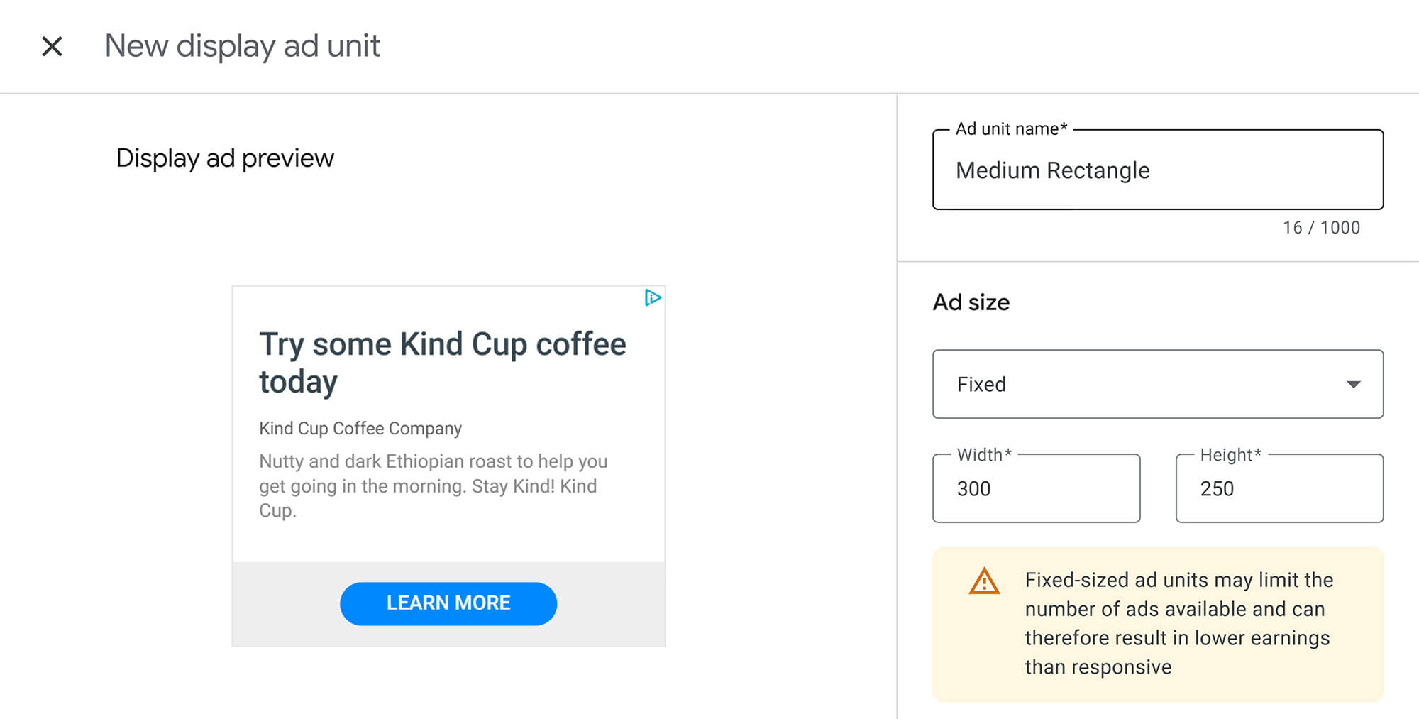
Take the 300x250 format, for instance. Its sheer versatility makes it a favorite for embedding right inside your content, where user attention is naturally high.
Publishers should put these “standard” top-performing Google display ad sizes first. This ensures high fill rates and access to a broader pool of advertisers. Deviating too much from these sizes could lead to a lower eCPM (effective cost per thousand impressions), simply because there’s less competition for those ad slots.
This display ad size consistently gets called a top performer, truly the “versatile” or “Swiss Army knife” of ad sizes. It plays nicely with mobile, text, and display ads. Its sweet spots are inside text content, at the end of articles, or in sidebars. It’s highly visible without hogging too much website space.
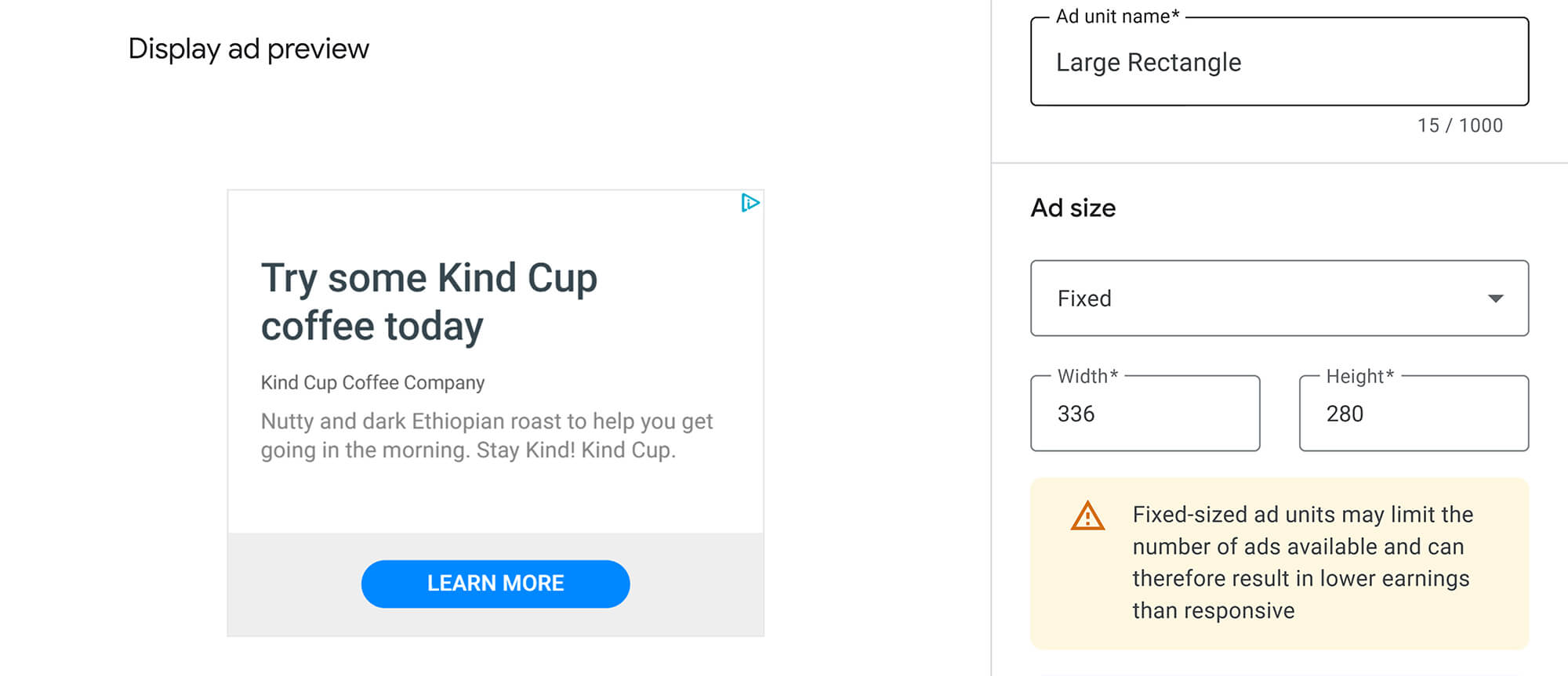
Another top-performing desktop ad size with excellent visibility. It behaves much like the Medium Rectangle. It works best when tucked into content or placed at the end of a post or article. Just a heads-up: it’s not really ideal for mobile display ads.
It is one of the most effective banner sizes due to its dimensions and prominent placement. Leaderboards tend to have more ad inventory available. This one works wonders at the very top of a page, above the fold (meaning visible without scrolling), and in forums. Bonus: it’s tablet-friendly.

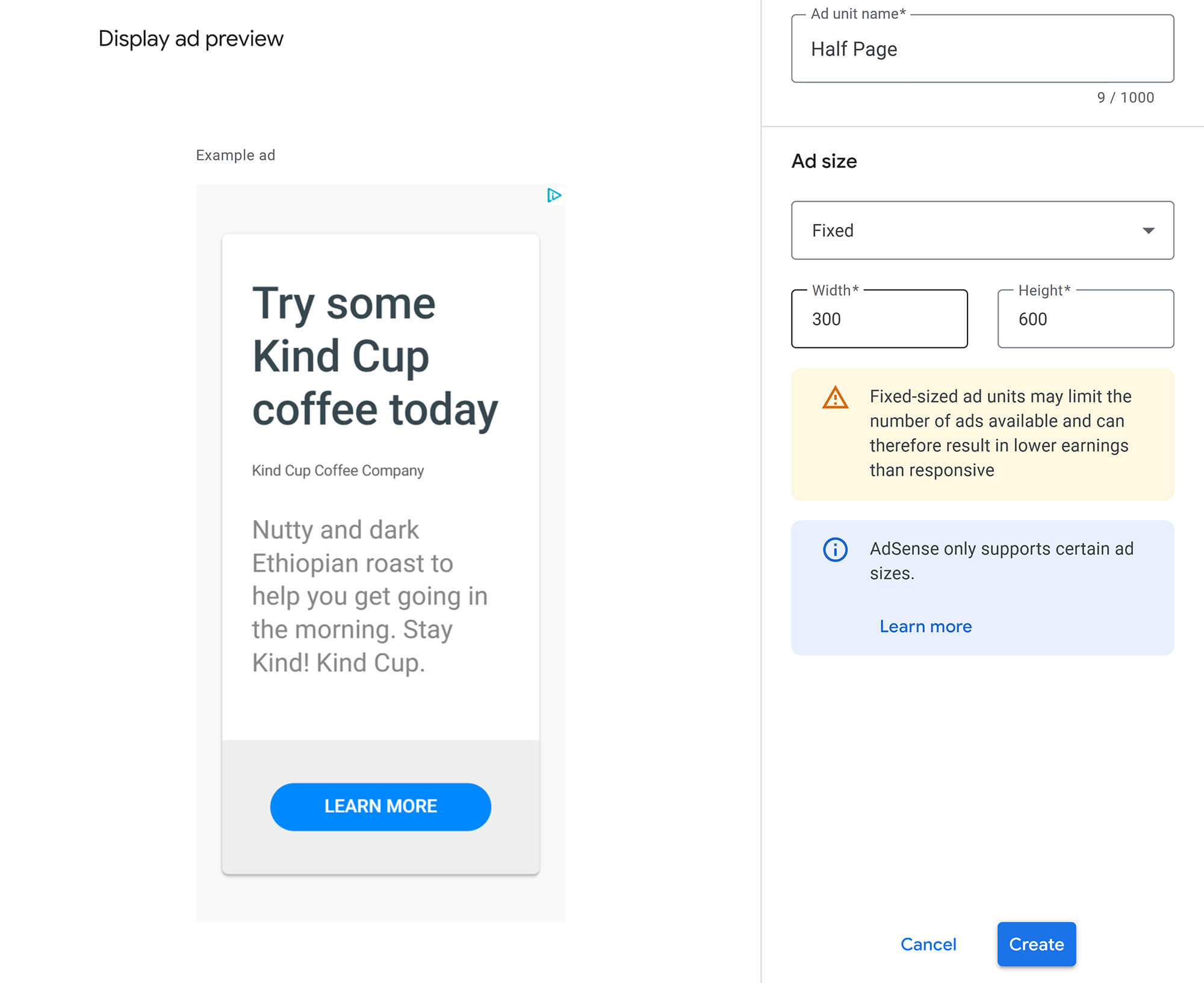
A large, highly visible ad unit that performs well on a desktop. It provides advertisers with ample space for their message, resulting in impactful ads. It often boasts higher engagement rates. This one is perfect for page margins.
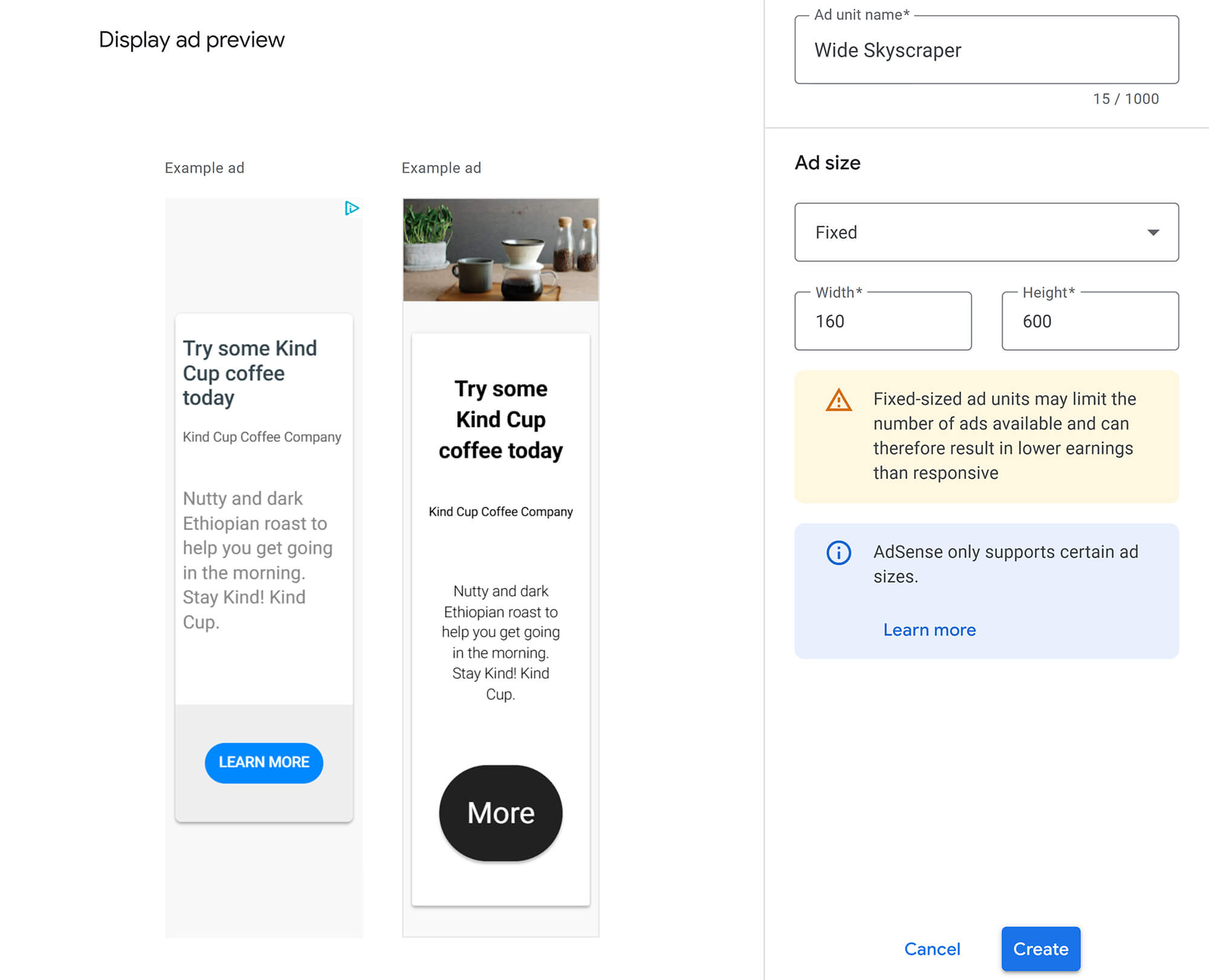
An ad format that’s notably taller than it is wide. It’s popular because of its size and visibility. Ideal for placing along page margins, making it less intrusive. Users can see it as they land on a page and scroll down.
Explicitly highlighting mobile-specific Google display ad sizes as top performers for handheld devices directly reflects the shift in user behavior. Mobile users tend to have shorter attention spans and are often looking for instant solutions. Plus, mobile ads usually have higher click-through rates and conversion rates compared to desktop ads.
Smaller screen sizes and varying consumption patterns on mobile devices require ad sizes that are optimized for visibility without being overly intrusive. Mobile users are more likely to interact with ads that seamlessly blend into their mobile experience.
So, publishers absolutely must adopt a mobile-first mindset for their ad strategy. Relying solely on desktop-optimized sizes for mobile traffic will lead to lackluster performance.
A top-performing mobile ad format. It’s delivered exclusively on mobile devices. It works really well as a large ad unit, especially when placed at the bottom of the page.
Considered one of the most influential mobile ad sizes. It’s mobile-optimized and performs great at the top or bottom of a page.

Super versatile, this one also works perfectly on mobile devices. It’s best placed within your content on mobile, as its proximity to the text creates a substantial impact.
To make things super clear, here’s a handy table summarizing the most effective Google display ad sizes, their device compatibility, and where they typically shine. This provides a quick reference for enhancing your AdSense revenues.
| Ad Size | Device Compatibility | Optimal Placement | Main Advantage |
|---|---|---|---|
| 300x250 (Medium Rectangle) | Desktop, Mobile, Tablet | Within text content, article end, sidebars | High inventory, versatile, visible, non-intrusive |
| 336x280 (Large Rectangle) | Desktop | Within text content, article end | High inventory, excellent visibility, strong performer |
| 728x90 (Leaderboard) | Desktop, Tablet | Top of page (above the fold), forums | High inventory, prominent, tablet-friendly |
| 300x600 (Half Page) | Desktop | Side margins | Large ad space, high visibility, high engagement |
| 160x600 (Wide Skyscraper) | Desktop | Side margins | Tall & lean, less intrusive, visible on scroll |
| 320x100 (Large Mobile Banner) | Mobile | Bottom of page (mobile) | Top mobile performer, mobile-only |
| 320x50 (Mobile Leaderboard) | Mobile | Top or bottom of page (mobile) | Top mobile performer, optimized for mobile |
When it comes to AdSense, you can broadly categorize users into three types:
Heatmap tools, like HotJar, are great for showing you exactly where clicks are strongest and weakest on your page. This often aligns with an “F-pattern” scanning behavior, where users focus on the top and left sides of a page.
Understanding user psychology and these heatmap insights is absolutely crucial for where you decide to place your ads. Users interact differently with content and ads depending on their intent and how they scan a page.
Therefore, publishers can utilize heatmap analysis tools to effectively optimize their specific ad placements. This goes beyond just generic advice, such as “above the fold.” It enables a more nuanced, data-driven approach tailored to your audience’s unique behavior, ultimately leading to higher click-through rates and increased engagement.
Alright, we’ve covered a lot of ground on Google display ad sizes. Now, let’s distill it all into some solid, data-backed recommendations to really supercharge your AdSense performance. Think of these as your personal cheat sheet.
First off, prioritize responsive design. It’s the smart move. You should use responsive ad units as your primary choice. This ensures maximum adaptability across all devices and, crucially, maximizes your earning potential.
Next, focus on those effective Google display ad sizes. We’re talking about the “Big 5” for desktops: 300x250, 336x280, 728x90, 300x600, and 160x600. For mobile, stick with the mobile-specific champions: 320x100 and 320x50. These particular Google display ad sizes consistently stand out because they have tons of inventory and a proven track record of getting results.
Also, align your placement strategically with user behavior. Don’t just guess! You should leverage heatmap analysis tools to gain a deeper understanding of how users click and scan your pages. This helps you place ads optimally, whether it’s above the fold, nestled within your content, or tucked into sticky sidebars.
Finally, and this is crucial, continuously track and optimize. You can’t set it and forget it. Regularly A/B test your ad sizes and placements. Make sure you’re monitoring a wide range of metrics beyond just click-through rates. Consider impressions, viewability, and conversion rates, particularly in light of the shift towards CPM. Your AdSense reports, and Google Search Console are your best friends here.
To sum it all up, picking the right Google display ad sizes and placing them strategically is absolutely critical for your success as a publisher. The clear trend points directly to responsive ad units. They flex and adapt beautifully across different devices, which maximizes both your visibility and your potential earnings. While fixed ad sizes might still make sense in certain very specific niches, responsive ads offer a far superior solution for today’s mobile-first internet.
By prioritizing powerful, device-friendly sizes and making informed placement decisions based on user behavior, you can significantly increase your ad revenue. Ongoing monitoring and optimization using analytics tools are essential to unlock AdSense’s full potential. If you take these recommendations to heart, you’ll be perfectly positioned to thrive in the ever-evolving world of online advertising.