In digital marketing, where visual content reigns supreme, understanding the subtle yet powerful influence of color is paramount. A recent study, Numerological and neuromarketing perspectives on color in digital marketing: Enhancing click-through and conversion rates by Sidhharrth S Kumaar, published in the International Journal of Research in Marketing Management and Sales (2025), delves deep into how specific color choices and contrast levels impact consumer behavior at a neurological and behavioral level.
This research offers crucial insights for marketers seeking to optimize their digital campaigns for increased engagement and conversions.
Over the past decade, digital marketing has increasingly focused on creating aesthetically pleasing and emotionally captivating material. Color psychology plays a vital role in this evolution, as colors act as powerful visual cues, triggering specific emotional responses and significantly influencing customer behavior. Understanding these neurological and behavioral reactions to color is crucial for advertisers seeking to optimize the effectiveness of their campaigns.
Color psychology suggests that different hues evoke distinct psychological and emotional responses. For instance, warm colors like red and yellow are generally associated with enthusiasm and urgency, while cool colors such as blue and green often convey peace and trust.
These associations are not merely cultural but also rooted in evolutionary biology. Research indicates that up to 90% of snap decisions about products can be based solely on color. Behavioral economics further emphasizes the importance of visual stimuli, demonstrating how even minor environmental changes, for example, color adjustments, can significantly impact decision-making at a subconscious level.
The study employed both qualitative and quantitative methods to investigate brain and behavioral reactions to color in digital marketing. A sample of 1,000 participants, aged 21-50 and equally split between males and females, was recruited through online platforms.
The researchers created digital advertisements featuring various color palettes and displayed them within a virtual web browser environment to simulate real-world conditions. In addition, neuromarketing instruments, including electroencephalography (EEG) and eye-tracking sensors, measured participants' neurological and ocular responses.
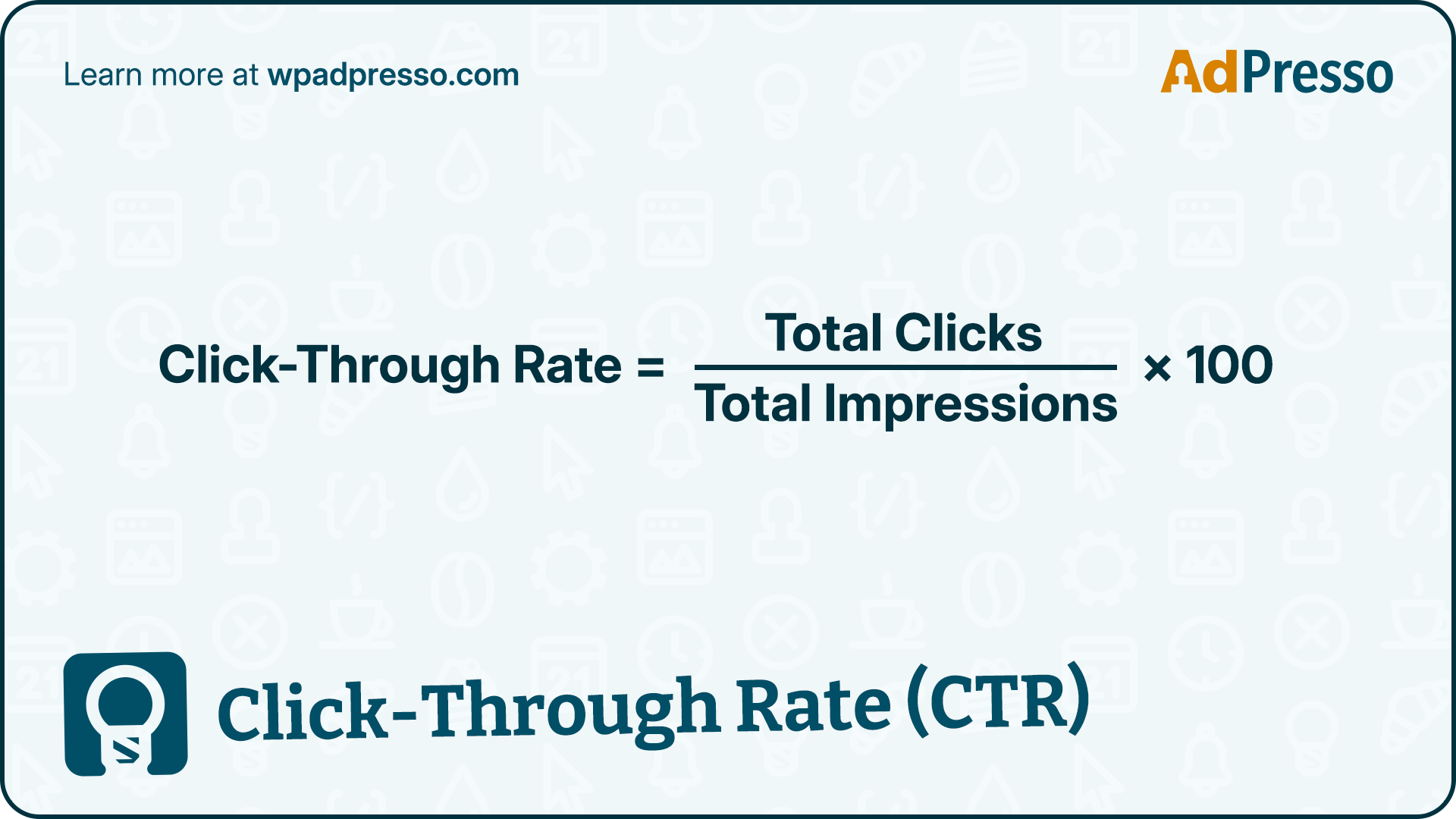
Behavioral statistics, such as click-through rates (CTR) and conversion rates, were also noted. The scientists collected quantitative data using web analytics software while obtaining qualitative data from post-experiment interviews, where participants discussed their impressions and emotional reactions to the ads.
The research yielded clear insights into how color choices and contrast levels influence consumer behavior and brain activity in digital advertising.
The study revealed a distinct preference for warm colors and high-contrast advertisements, as evidenced by both click-through rates (CTR) and conversion rates.
These results align with existing color psychology research, suggesting warm colors create more enthusiasm and urgency, driving quick decisions. High contrast, conversely, improves visual clarity, making ad content more straightforward to comprehend and interact with.
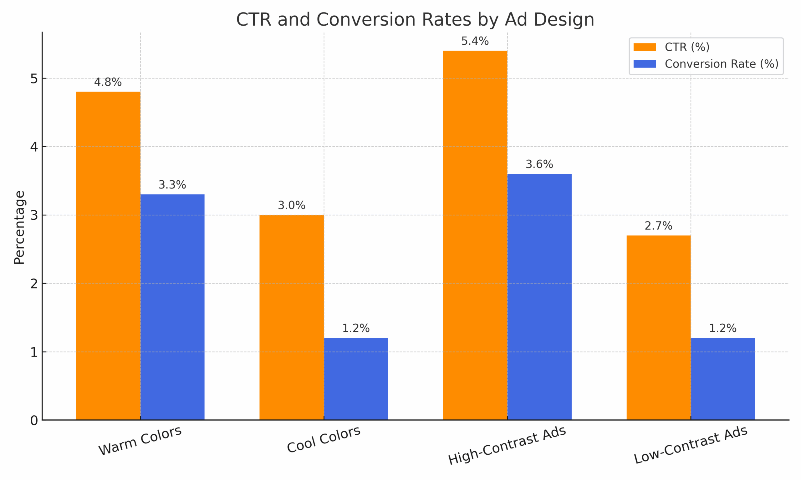
Eye-tracking studies further validated the effectiveness of warm colors and high-contrast visuals.
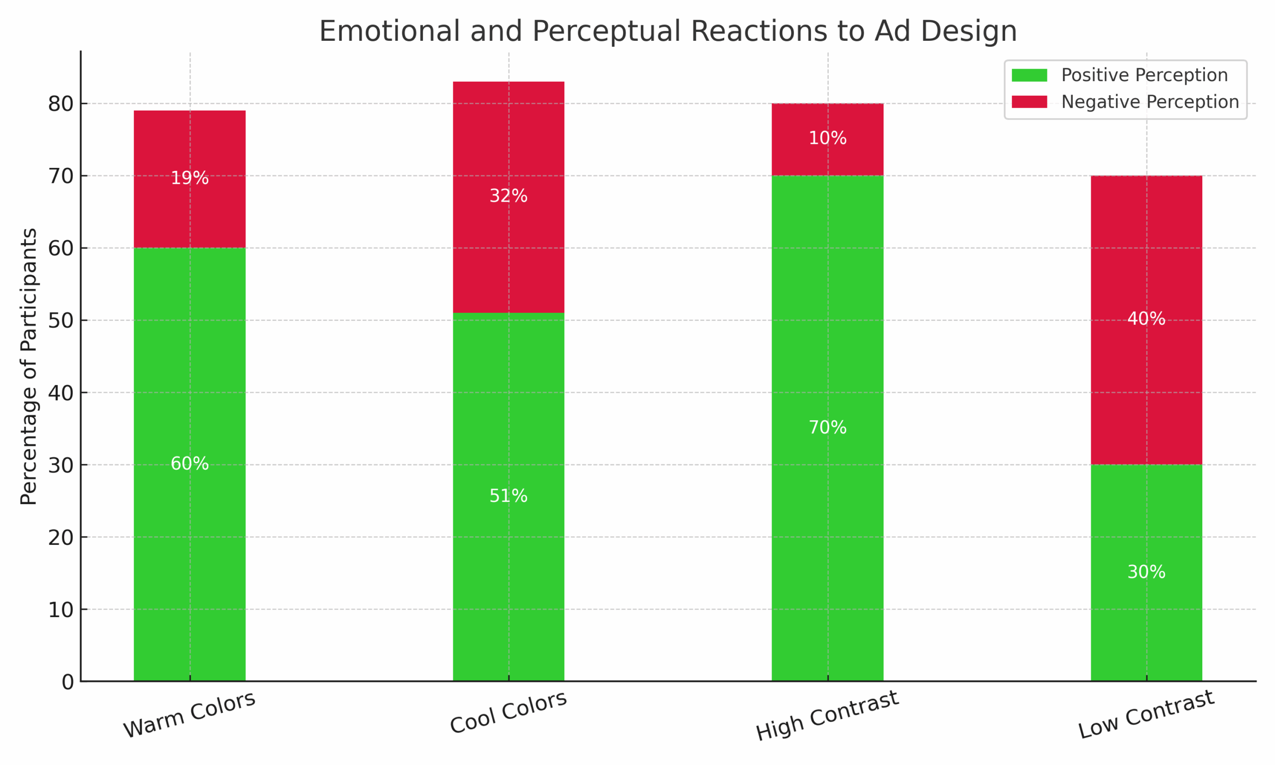
Interviews revealed more profound psychological and perceptual effects:
Thematic analysis confirmed that warm colors and strong contrast consistently generated more interest and focus, while warm colors evoked stronger emotional reactions, both positive and negative. Cool hues were associated with trust and calmness, making them particularly beneficial for industries such as financial services. High contrast improved clarity and concentration, helping participants process ad content more effectively.
The study also integrated numerological and Panch Mahabhutas (Five Great Elements) perspectives, connecting color efficacy to the energetic and dynamic properties of their related numbers and elements. For instance, red (linked to number 9, Mars) is energetic and passionate, explaining its high CTR. Blue (linked to number 4, Uranus/Rahu) fosters dependability, but may not inspire quick action.
This comprehensive study highlights the crucial role of color and contrast in digital marketing, significantly influencing consumer behavior and neurological responses. It empirically demonstrates the superior performance of warm colors and high-contrast advertisements in driving click-through and conversion rates.
By integrating these findings, marketers can craft more engaging and effective digital ads that resonate with target audiences on both conscious and subconscious levels, fostering higher engagement and ultimately leading to more tremendous marketing success.
Want to dive deeper into the research? You can download the complete study for free here.